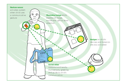
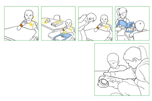
This system allows the child to use their existing gestural communication to express them self to their peers and caregivers. It incorporates gesture sensing, an immediate expressive utterance based on the child's personality and the emotion of their gesture to get attention, and an introductory"guide" to the child that explains how best to communicate with them using their available means.
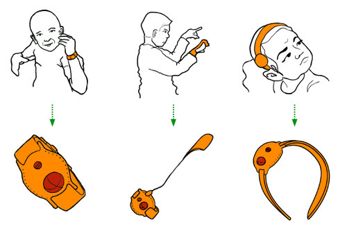
The child communicates using an existing gesture they already use to communicate. When they get the system there is a training period when their caregiver presses a button on the sensor they've chosen every time the child does the gesture, so the system can learn the signature. Later, whenever the child does that action the system will be activated.
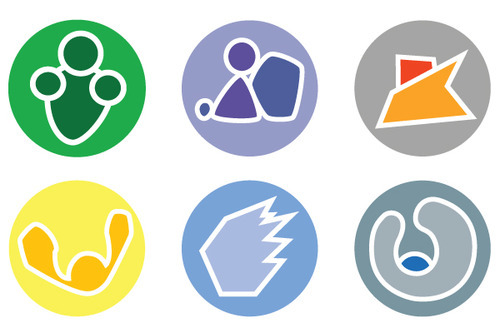
The child and caregiver choose an icon for the child's badge to convey who they are. Each badge represents a personality type, and is capable of a full range of emotional expressions related to that personality. It is important for a child who is normally bubbly and fun to be able to make an angry expression, and vice versa.
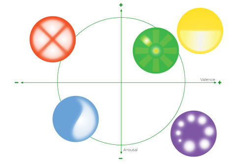
The first set of badges were symbolic of characters, this is an alternate set that are more abstract. They represent emotions and valances but not in case some users who feel uncomfortable representing themselves with a "spokesperson" or avatar.
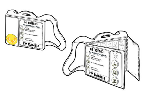
The social atlas is a social and communication guide to child. It also has a badge on it to draw attention to the full range of communicative abilities the child has. This way if someone meets them they will have an opportunity to communicate with them without frustration. The atlas is plush and portable and low tech so the child can always keep it with them, even if their other devices are unavailable. It has audio buttons for listeners who need audio support and contains extra pockets for additional helpful materials such as symbol boards or sign language guides.
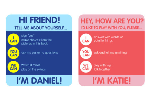
The cards in the social atlas emphasize the ways the user and listener can contribute to a positive interaction.

The installation would be beautiful to drive by over the bridge. It is our hope that it would inspire people to change their attitudes about renewable energy from necessary evils in the landscape to potential sources of beauty.
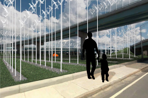
Daytime view of the installation

Night time view of the installation. The turbines are coated with photoluminescent paint to illuminate the area.

The site could provide around 7358 megawatt hours per year.

The installation could be used to power the cars that drive through it every day. It would produce enough power for (check the number from the presentation) cars.
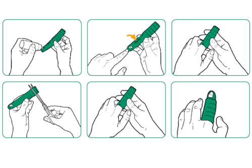
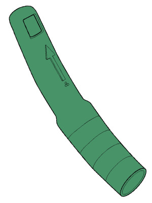
The final splint was finished by my collaborators after my internship ended. I helped them finish up the packaging when I returned to work for them again. There is a U.S. Provisional Patent filed for the splint, and I am a co-inventor.
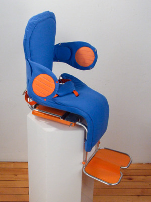
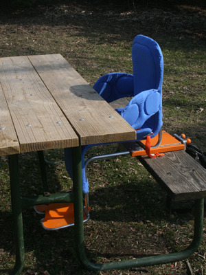
The height, footrests and chest supports are adjustable. There is flap which tightens around the hips when the seatbelt is tightened, a pommel and crotch strap for stability, and the seat moves forward to bring Garrett closer to the table.
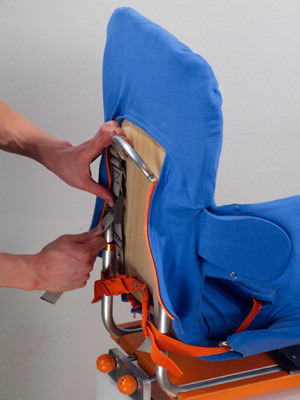
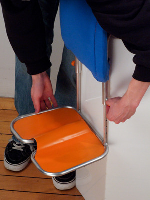
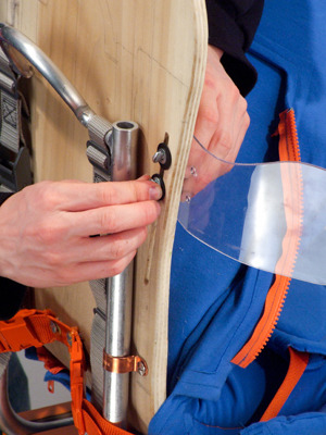
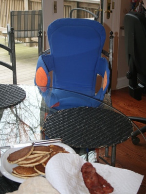
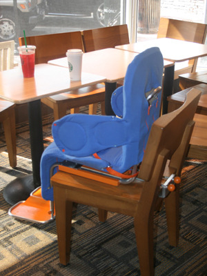
The chair can be used in many settings to help Garrett have access to new areas in the community and at home.
This exhibit about Global Hunger is a collaboration with Carolyn Spinney (RISD ID '09). We wanted to explore how the tactile experience of the volume of food could drive home the reality of how little people have in some parts of the world relative to others. We also wanted to give people a way to help, not just upset them, so we had a meal donated to the Hunger Site for every time someone used our exhibit to learn.
Lose and Find, a collaboration with Ryan Coyle (RISD ID '10) and Carolyn Spinney (RISD ID '09), is for a course called Experience Design. We imagined a system where RFID tags can be used to trace the history and owners of an object as it changes hands due to loss, yard sales and moves.


The idea I decided to go with was to create a wide basin that is held with both hands to distribute the weight. Because it's wider it isn't necessary to bend the wrist as much to pour, and the user can pour from their elbows, which are stronger. I also chose this idea because pouring from the basin was evocative to many people who tried it of making an offering. It reinforced for them the idea of connecting spiritually to their garden. I tried an aesthetic approach that was more "Rubbermaid" and one was that was more "Smith and Hawken." Fact is, I'm not very satisfied with either, I think they look like bedpans.

My nightlight would be made by cutting paper with only one die and can be sold in a flat envelope. The user assembles it and can control the brightness by peeling open more layers.


These are photos of the final looks like model I made for this project and a diagram of how it is used. It can be worn any which way the doctor or nurse wants, but if it is bumped it will likely make a mess, so it "gently" encourages mindfulness.


